
Title: Shades of Earth
Author: Beth Revis
Probably one of the worst ideas for a cover change in history. You'll probably notice as you scroll down this post, that a lot of the books I picked have suffered from unfortunate cover changes. This one has to be one of the worst. The first two books in the series had beautiful covers, and then someone had the bright idea to change it to this! And have it be the last book as well with a totally different cover! I haven't read the series yet, and I know a lot of those glass half full people will say that these new covers really capture what's happening in the books. I don't really care. It is an ugly cover. Just blah. I will read the series though, but bad bad cover change.

Title: Shatter Me
Author: Tahereh Mafi
This is another cover change, and a lot of people tend to like this cover change decision. To be honest, I didn't think the original cover of this book was that great either. What makes this a terrible cover for me is the eyes. Eyeballs kind of creep me out when they are on covers. And when you think about it, eyes really aren't that beautiful of an image. Especially just one eyeball with weird eyelashes and an overabundance of water. I sometimes feel like the eyes on book covers are following me. I just don't like eyes on covers, which is why I don't like these covers. The color scheme is alright, but I's don't like the eyes.

Title: Vampire Academy
Author: Richelle Mead
These covers have been unfortunate looking from the start. There is always something about sticking a random close up of a face on a cover that usually doesn't spell beautiful. I will say that the designers did stick with a cover idea and carry on with it until the last book, so bravo for that. I've never been a real fan of these covers and I don't think they've ever really tried to make them look better or fix them. The girl on the cover really reminds me of a Laura Croft/Angelina Jolie. Does anybody else see it? I still need to finish this series. I've read the first book and need to get on with the others.
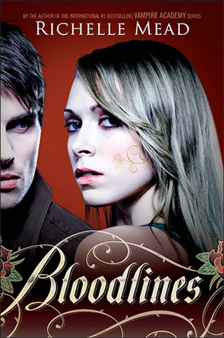
Title: Bloodlines
Author: Richelle Mead
This makes my terrible covers list for the same reasons the book above did, I just don't have a thing for random girl faces on a cover. I love the typography and the swirly swirls on her face, but I don't like the weird profile shots of her and the boy. I think on the shelf, this series looks fantastic because the spines are beautiful. But the fronts are half terrible. If they had just went with the typography and the swirls, it would have been A+, but throw in random, closeup human faces, and it becomes terrible.

Title: Nightshade
Author: Andrea Cremer
This is another book that got a terrible cover change midway through the series. The cover for the first book was beautiful, and then they decided to go with this. First thing wrong, random girl profile. The idea they were going for with the wolf thing was kinda cool, but it didn't work itself out into anything spectacular. Just stop with the random girl faces.
So that's it for this weeks Top 5 Wednesday: Top 5 Terrible Covers. What book covers do you think are the most terrible? I'd love to know. Here's a complete list of all the Top 5 Wednesdayers if you wanna check them out and join in on the fun.
No comments:
Post a Comment